 Ever want some music go with what you’re doing, but can’t quite figure out where to start? Maybe you’re studying, doing housework or having a nice dinner, and you don’t want to pick just one artist or album, but you don’t have a whole playlist ready to go.
Today Slacker Radio releases “My Vibe” which the company hopes will help out in just these sorts of situations. It’s part of Slacker’s new app for iOS7, which Apple launches today. That means today is also the launch day for Apple’s iTunes Radio, itself introducing some major competition into the mobile radio app world.
The resdesigned Slacker app is only on iOS7 right now. Though Apple’s new mobile OS is due to launch for download today, as I publish this piece it is not yet available. So I have not yet been able to put the new app through its paces on my own iPhone. But I did get a walk-through of the Slacker app from Slacker Chief Product Officer John Hayase.
He said the “My Vibe” feature is about “the idea of being in the moment. You’re doing an activity and in a certain mood. You’re not looking for a particular song, but something to go with what you’re doing.”
According to Hayase “My Vibe” is curated by “a group of professional radio people who love radio and who love to pull music and put it together in ways that computer’s can’t.” He said that Slacker is trying to deliver “a reinvisioned radio experience that is the next generation of radio.”
Even subscribers who pay for Slacker’s on demand service–where they can select specific albums and tracks–are spending 84% of their time listening to a curated station. “That’s what users find special about Slacker,” Hayase said, “so we’re making them more curated.”
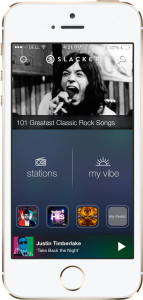
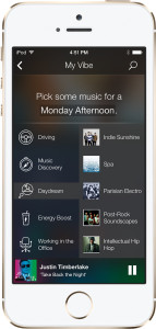
On the redesigned Slacker app “My Vibe” is featured prominently on the home screen. Selecting it brings up a one-screen interface with a list of moods on the left based upon the current time and day. When you select a mood, on the right there is a selection of five playlists across different genres to choose from.More than 80% of Slacker users are on mobile now, so it’s a high priority for the company. The new app is designed to put fewer clicks in front of the user listening to music. “You immediately get a play button,” when you open the app, Hayase said. “We want to get you to music.”
The current track is always displayed at the bottom of the screen in the new app, including the home screen. Just above the current track are shortcuts to a user’s favorite stations, which Hayase compares to the presets on a car radio.
The top of the home screen has trending features and news on a carousel, with items like an artist of the week, current events or upcoming specials.
Specials, such as “101 Greatest Classic Rock Songs,” are hosted by human DJs who Hayase said “walk you through the content. It’s not just about music, it’s about another person who is there and walking you through a journey of discovery.” When human hosts were added, those channels saw an average time spent listening go up almost 20%; on the Classic Rock special there was nearly a three-fold increase.
The redesigned Slacker app is currently only available for iOS7, and can be downloaded free from the App Store by anyone on the new OS. Anyone using iOS6 or earlier will receive the previous version of the app. Slacker says an Android version of the redesigned app “will be available soon.”


